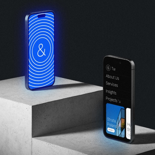
Forde & O’Meara LLP. Release year 2025 Location Chicago, USA Business Law Services Categories Branding Copywriting Creative Direction Editorial Design Logo & Identity Forde & O’Meara had been around long enough to earn the trust of some of the biggest law firms in the country. Their work was high-level, complex, and precise. They didn’t advertise. They didn’t need to. Within the legal world, their name carried weight. But their brand? It was stuck in the past. Silent in the wrong ways. Invisible when it should’ve spoken with quiet authority. They came to us not asking for a revolution, but for alignment. They needed a visual identity that felt like them: sharp, composed, respected. One that didn’t overexplain, but understood its audience. One that, like their own work, operated with intention and control. Designing for lawyers isn’t like designing for lifestyle brands. It’s a world where emotion takes a backseat. Where boldness is subtle and trust is everything. So we listened. We watched how they presented themselves, internally, in courtrooms, in communication with peers. We paid attention to the unspoken. What emerged was a brand built from mid-century logic and modern clarity. A system rooted in order and timeless design. It found its home in PowerPoint slides, courtroom decks, letterheads, LinkedIn templates, and a website that doesn’t try to impress. It simply reflects who they are. This wasn’t a showy transformation. It was a recalibration. A quiet evolution that said exactly what it needed to say: People in the know, know them. Visit Forde & O’meara LLP for more